The Chart is a graphical representation for data visualization, in which the data is represented by symbols, such as bars in a bar chart, lines in a line chart, or slices in a pie chart.
Charts allow users to see the results of data to better understand and predict current and future data.
In this article, you will learn
Introduction
Installing the Chart App
Grouping
Introduction
Installing the Chart App
To add a Chart App to your stack, add it from the app dashboard. Click on Apps.
Click the Add an app button that appears. You can add Chart App in 2 ways.
- From the Dashboard click on + Add an App
- Click on Add an App button.
Now dialog box is displayed, select Chart, and then click on Add App button.
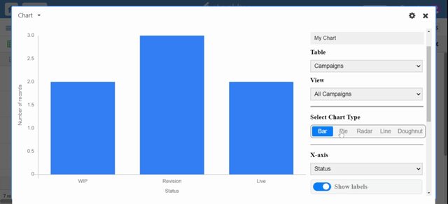
From the settings, you can select the desired table and view what you wish to visualize.
Here, you will add the helpful Name for your chart, select your Table, and View it from the drop-down list.
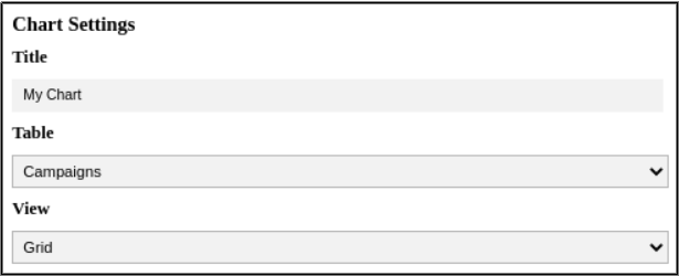
Once your table and view are selected you will choose a chart type to add to your dashboard.
They are:
- Bar charts are generally used to compare specific X-axis values, like the number of assignments each collaborator has in a project management stack.
- Pie charts make sense to show a parts-to-whole relationship for categorical or nominal data.
- Radar charts are a way to visualize multivariate data. They are used to plot one or more groups of values over multiple common variables.
- Line charts are most often used to track changes over time, but they can also be used for when there is some other sequence, like stages in a pipeline.
- Doughnut charts are useful in situations where you want to compare the relative proportions of a data set's constituent subsets.
Configure the x-axis:
To display data in the x-axis, first select a column from the drop-down list.
You can also choose whether or not to show labels. You can also choose whether or not to include data from cells that are empty in the specified column by selecting the "Include empty cells" option.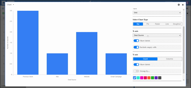
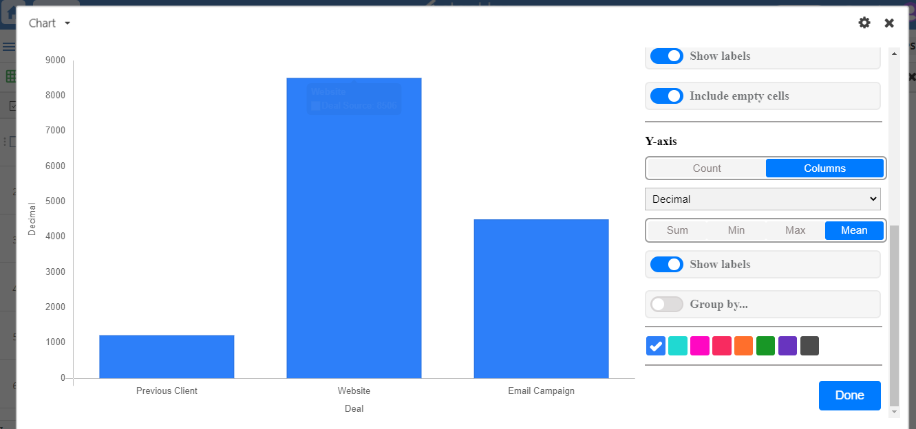
Configure the y-axis:
By default, the Y-axis is configured to show Count. This means that the chart will plot the number of rows that have each X value on the Y-axis.
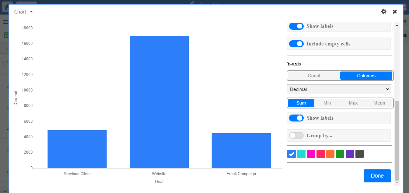
You can also aggregate the values to show the sum, min, max, or mean of all the values, once you click columns. From the drop-down select the number type column on which you want to perform aggregation.
Grouping
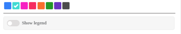
You can also choose to group by a third column if you have any single select or single collaborator column. Choosing to group your rows will introduce individual colors for each group, giving you more options for visually distinguishing between different bars, points, and lines.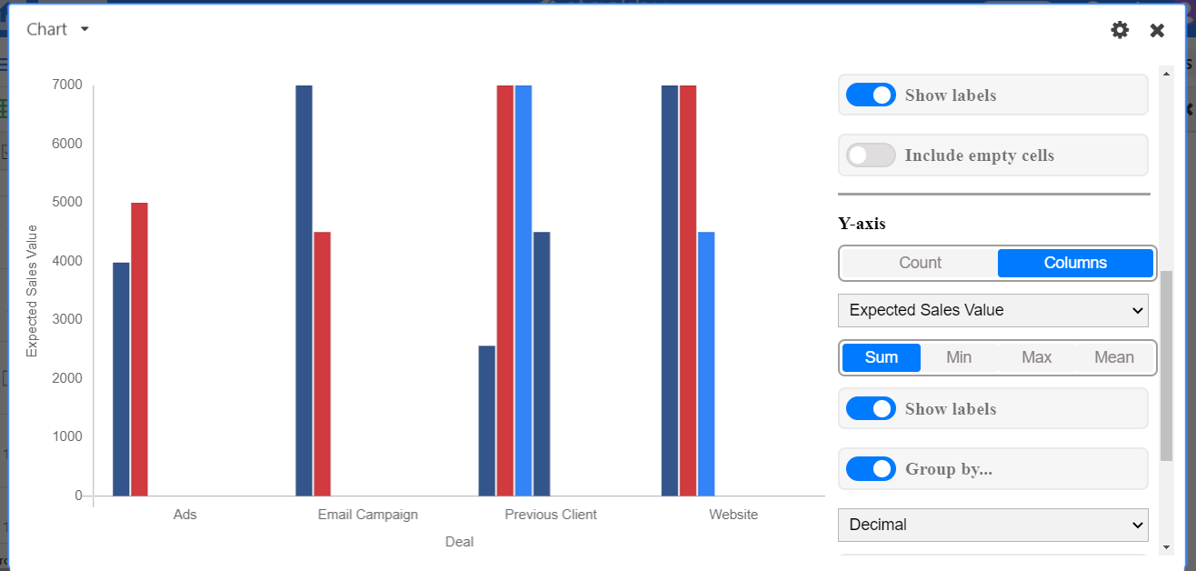
The stack option stacks the different groups on top of each other.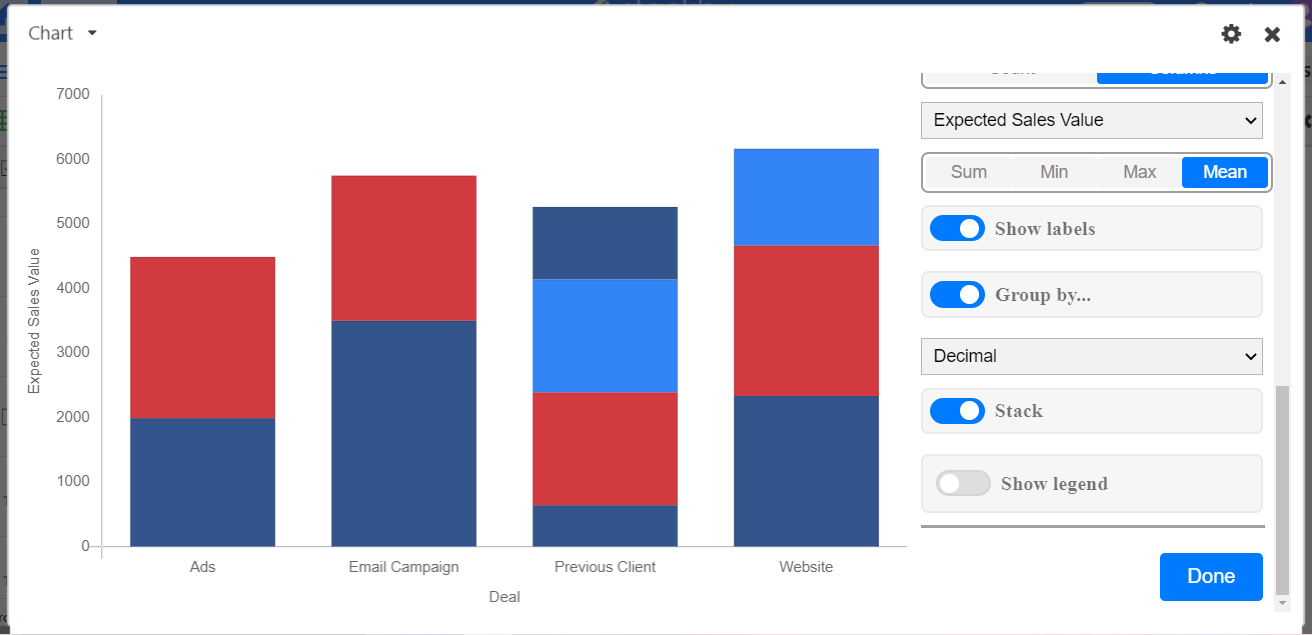
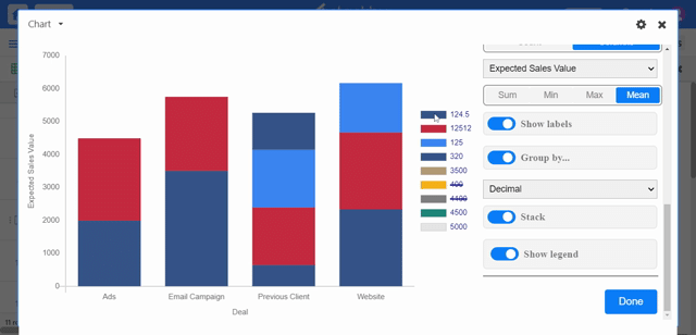 Even you can add colors. If you wish to display the legend in your dashboard just turn on the show legend toggle.