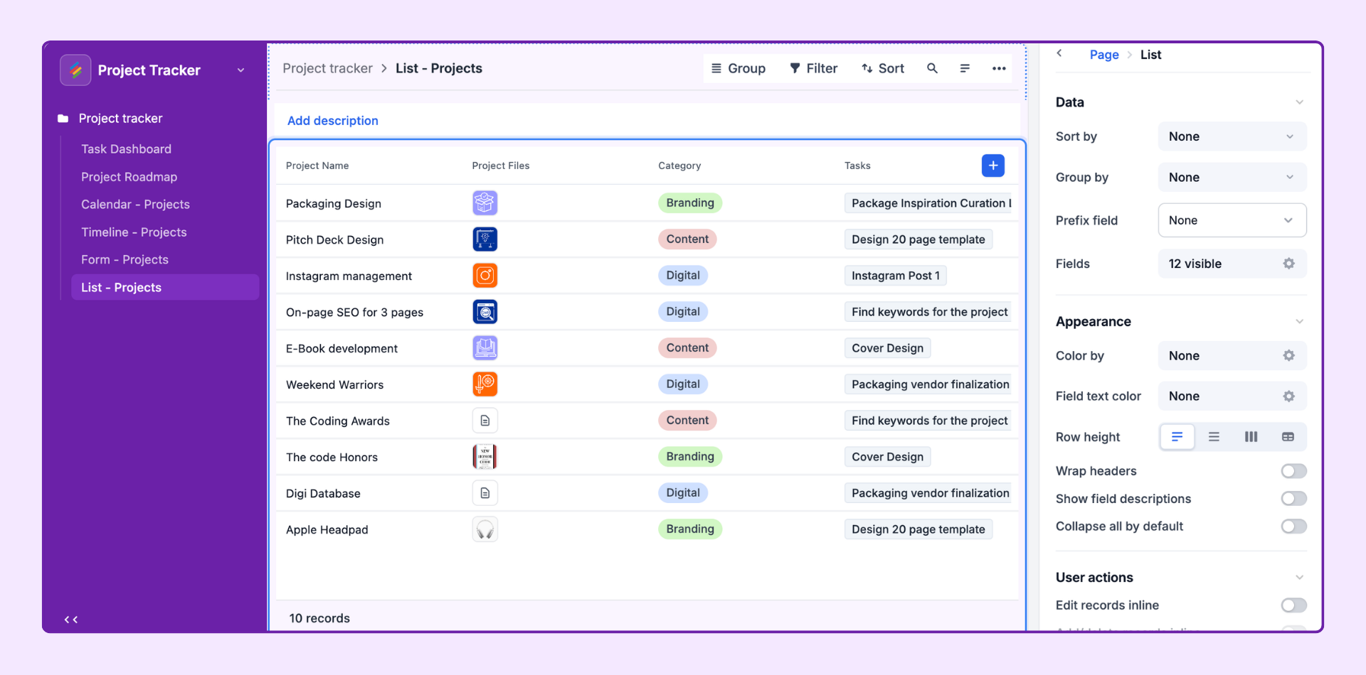
The List layout is the most versatile and commonly used Interface layout for everyday record browsing and management. It presents records from a Stack in a clean, structured list — similar to a simplified Grid view — with powerful filtering, sorting, grouping, and inline editing capabilities that make it ideal for operational workflows.
The List layout is the recommended starting point for most Interfaces. It is fast to set up, easy for end users to understand, and supports nearly every user action Stackby offers.
Task management — Browse and update tasks, set statuses, reassign owners
Project tracking — View all projects at a glance, filter by team or status
Content pipeline — Review articles, campaigns, or briefs in a prioritized list
Lead management — Work through a list of contacts or opportunities
Inventory management — Scan and update stock items quickly
In the Interface editor, click + Add Page in the left panel.
Select List from the Layout Picker. Click Next.
Choose the source Stack (table) for this page. Click Finish.
The List page opens in Edit mode. Configure it from the properties panel on the right.
Click on the background of the page canvas (not on a specific element) to open the page-level properties panel on the right.
Set the page's display name as shown in the left navigation. Choose a name that communicates the page's purpose to end users — e.g., "Open Tasks," "Active Projects," "Pending Approvals."
The Stack (table) powering this page. Set at page creation. To change the source Stack, delete and recreate the page.
Enable hierarchical display to show parent-child relationships across linked Stacks. For example, a Projects list can expand to show Tasks nested under each Project, with a second level showing Subtasks under each Task.
Click the cogwheel next to Levels to configure up to 3 hierarchy levels.
Each level is sourced from a linked record field in the Stack above it.
Toggle "Enable nested records below Level 1" to allow collapsible child rows inline in the list.
Levels cannot be used at the same time as Tab filters — choose one or the other.
Configure hard-set filters that always apply to this page. End users cannot change these. Examples:
Show only records where Status ≠ "Done"
Show only records where Assignee = "Current User" (use the dynamic "Current User" option to personalize per viewer)
Show only records created in the last 30 days
Show description — Toggle a text description visible above the list for end users.
Visualizations — Enable additional view types (Gallery, Kanban, Calendar, Grid) on the same page so users can switch between them via a dropdown. Click the cogwheel icon.
Click on the list canvas area to configure the list visualization specifically:
Filter by — Additional filters at the visualization level (stacked on top of page-level filters).
Sort by — Default sort order. Options: Manual (enables drag-and-drop when Edit inline is on), or any field ascending/descending.
Group by — Group records into sections by up to 2 fields. Common groupings: Status, Assignee, Priority, Category.
Prefix field — Show an extra field as a prefix label on each record row (e.g., a Status badge or Checkbox).
Fields — Choose which fields appear as columns in the list. Click the cogwheel on any field to set it as View-only vs. Editable.
Color by — Color-code rows using a single-select field (each option gets a color) or conditional logic (e.g., turn red when Due Date is past and Status ≠ "Done").
Field text color — Apply text color rules to specific field values within cells.
Row height — Short (single line), Medium, Tall, or Extra Tall. Taller rows show more content per field cell.
Wrap headers — Automatically expand header height to show full field names without truncation.
Show field descriptions — Display a ⓘ icon on fields that have descriptions, letting users hover to read them.
Collapse all by default — When groups are configured, collapse all group sections on page load so users expand only what they need.
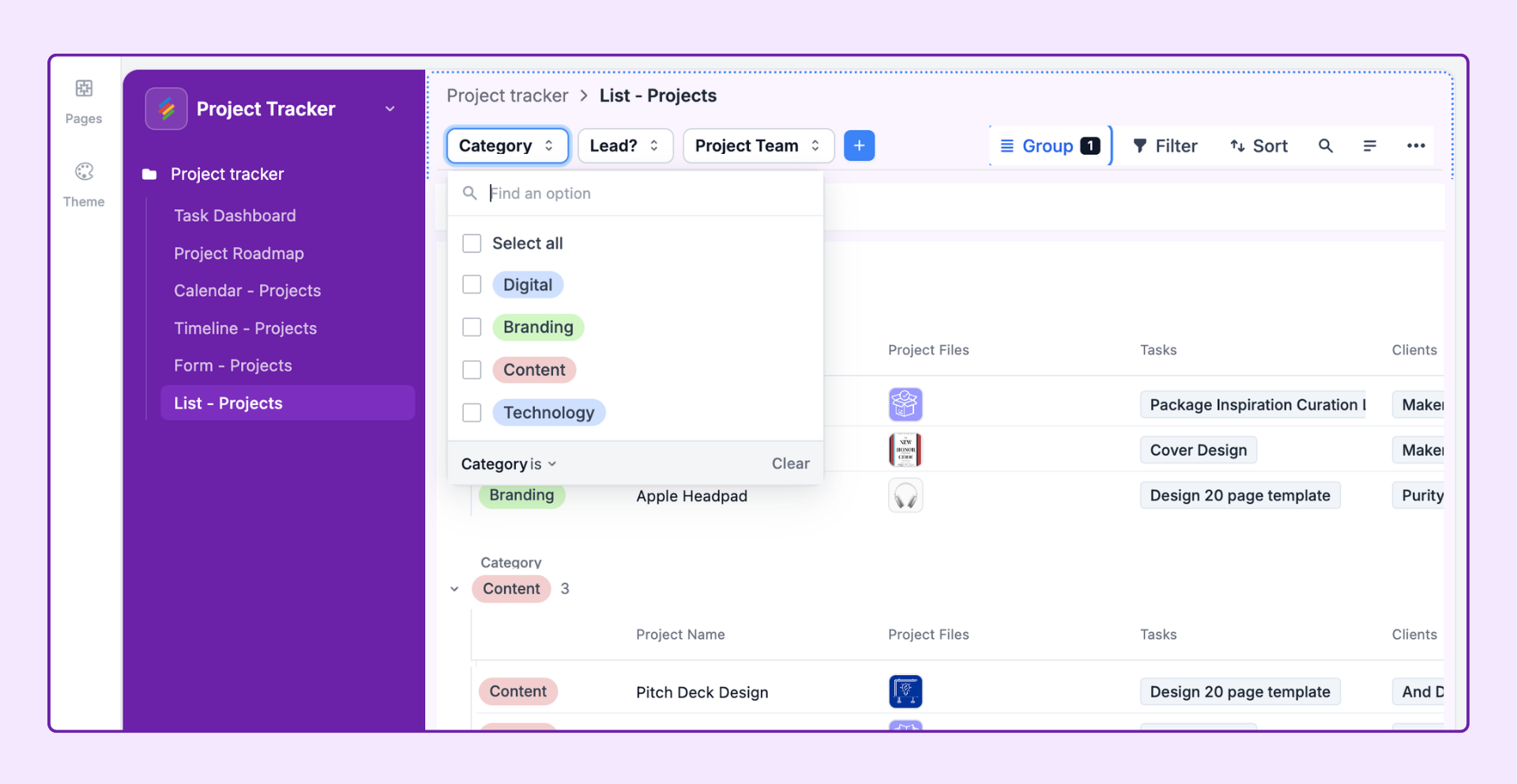
User filters let end users dynamically change what they see without altering the base Interface configuration. Configure from the User Filters section:
None — No user-side filtering. The list shows exactly what the builder configured.
Tabs — Display preset filter options as clickable tab buttons at the top of the list (e.g., "All Records," "Mine," "Overdue," "This Week"). Each tab is a predefined filter condition. Click the + button on the canvas to add tabs.
Dropdown — Display filter options in dropdown selector menus. Supports: Single select, Multi-select, Linked record, User, Created by, Date, Checkbox fields. Multiple dropdowns can be combined for drill-down filtering.
Configure what end users can do on this page:
Sort — Let users change the sort order of the list.
Search — Enable a search bar so users can search record titles and field values.
Filter — Let users set their own filter conditions. User-applied filters stack on top of builder-defined filters.
Group — Let users group the list by a field of their choice.
Edit records inline — Allow users with Editor permissions to click into cells and edit values directly in the list — no need to open a record detail panel.
Add / delete records inline — Let users add new records using the + button and delete records from the list. New records are created directly in the source Stack.
Click into record details — When a user clicks on a record, open a detailed record panel. You must configure the Record Detail layout separately. See the Record Detail article.
Add records through a form — Add a + button that opens a Form layout page for structured record creation.
Buttons — Add custom action buttons to the top of the page (e.g., "Open Intake Form," "Go to Dashboard," "Export").
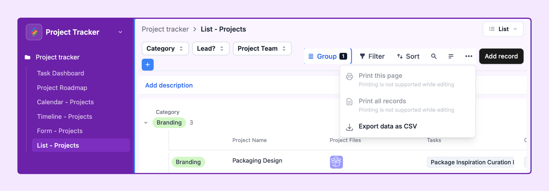
Allow users to export data as CSV — Adds a download option so users can export the current filtered/sorted list.
Allow users to print — Enables print/PDF export of the list. Respects current filters and sort order.
Allow users to import data as CSV — Lets users with Editor permissions add new records by uploading a CSV file.
A List page can also display the same data as a Kanban, Gallery, Calendar, or Grid by enabling additional visualizations. This lets one page serve multiple use cases:
In the page properties panel, click the cogwheel icon next to Visualizations.
Toggle on any additional visualization types you want to enable.
End users will see a dropdown in the top left of the page canvas to switch between views.
Each visualization type has its own settings — configure them by clicking on that visualization's canvas area.
When "Click into record details" is enabled, clicking a record in the list opens a Record Detail panel. You configure this panel separately as a Record Detail layout. The detail panel can show:
Any subset of fields from the source Stack
Fields from linked Stacks (via linked record expansion)
Editable and view-only fields
Action buttons (Update Record, Copy Link, Open Form, etc.)
Comments and revision history
Multiple List pages in the same Interface can share the same Record Detail layout — configure it once and reuse it.
A Grid view shows all fields as columns in a spreadsheet-like table. A List layout in an Interface hides the complexity of the full database, shows only the fields you choose, and adds user-friendly features like tabs, role-based permissions, and record detail panels — all within a controlled, publishable Interface experience.
Yes — the List layout supports grouping by up to 2 fields simultaneously. Records are first grouped by the primary field, then sub-grouped within each group by the secondary field.
When Sort by is set to "Manual sort," users with Edit records inline enabled can drag and drop records to reorder them. The manual order is saved and persists for all users viewing the Interface.
Not at the user level — all users see the same fields. However, you can set individual fields as View-only vs. Editable for users with Editor permissions. For different audiences needing different columns, create separate Interface pages.