All free and paid plans
Stackby App Builder lets you create focused, no-code app interfaces on top of your Stackby stacks. Instead of exposing collaborators to the full complexity of your tables, you can craft purpose-built views—for stakeholders, customers, or teammates—using a library of layouts and elements.
Apps built with App Builder can be:
Published internally to specific collaborators
Published publicly via a shareable link or a custom domain/subdomain
Themed to match your brand
To open App Builder for a stack:
Open the stack you want to build an app for.
Click Interfaces in the top navigation bar.
Click Build Yourself to add your first page.
Choose a layout type from the panel (see Layout Types below).
Configure the layout to connect to a table and view from your stack.
App Builder offers the following layout types. Each layout is a page in your app, and you can combine multiple layouts in the same app.
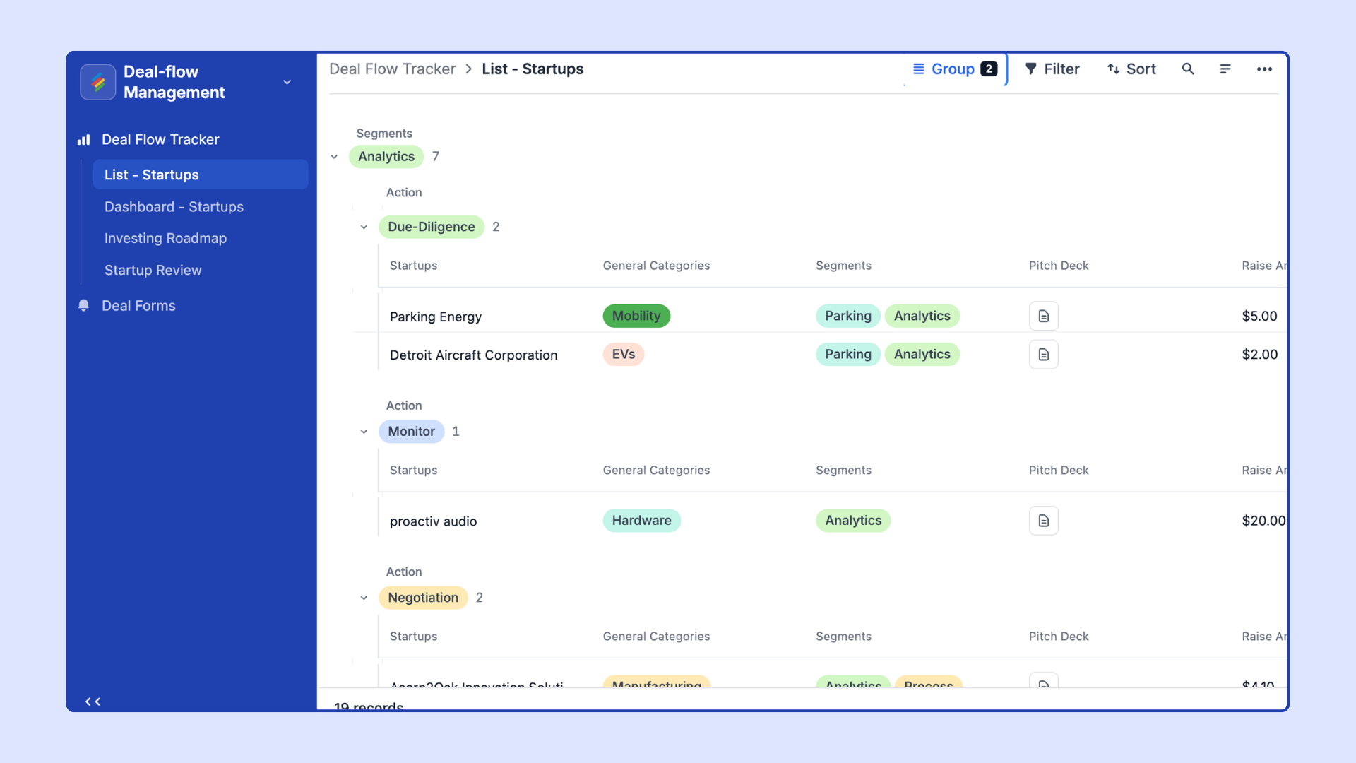
Display rows from a table in a scrollable list format. The List layout is ideal for:
Task lists and to-do trackers
Content queues and review lists
Any scenario where rows should be shown one by one
Configuration options:
Choose the source table and view
Select which columns to display and their order
Enable or disable the ability for viewers to click into individual rows
Set grouping and sorting options
Visualize rows as cards organized into columns by a single-select column value. The Kanban layout is ideal for:
Project tracking (e.g., To Do / In Progress / Done)
Sales pipelines
Content approval workflows
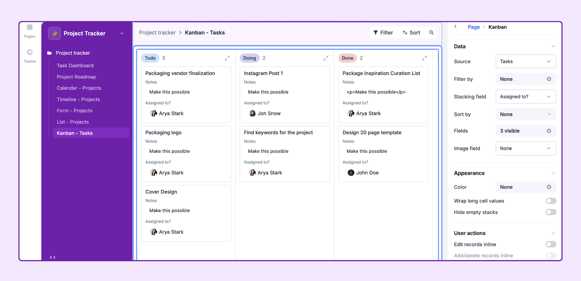
Configuration options:
Choose the source table, view, and grouping column (must be a single select column)
Choose which columns to display on each card
Enable drag-and-drop to allow viewers to move cards between columns
Limit visible columns to specific select values
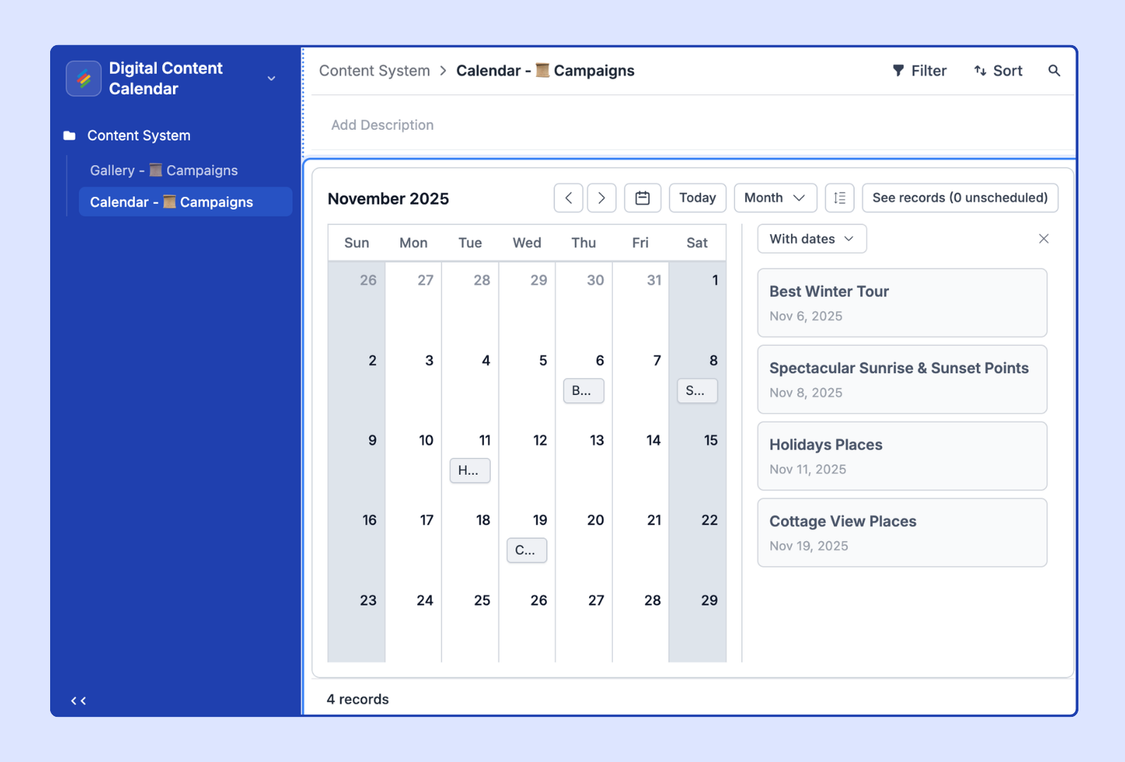
Display rows on a monthly or weekly calendar based on a date column. The Calendar layout is ideal for:
Editorial or content calendars
Event scheduling
Campaign planning
Configuration options:
Choose the source table and the date column to use
Choose an optional end-date column for spanning events
Select which columns appear on each event card
Toggle between month view and week view
Collect information from internal or external users through a customizable form. The Form layout is ideal for:
Intake and request forms
Survey collection
Event registration
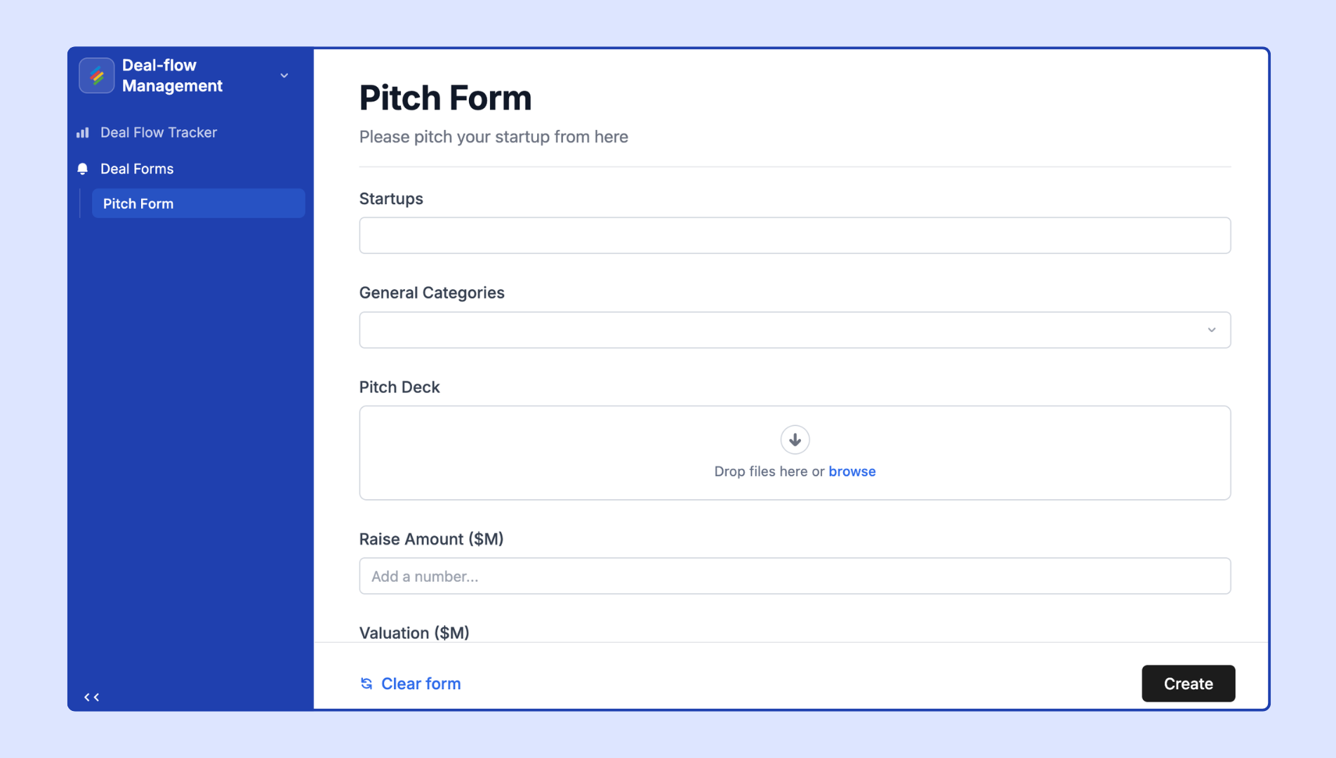
Configuration options:
Choose the destination table where form submissions are saved
Add, remove, and reorder form fields (columns)
Mark fields as required or optional
Add a custom confirmation message
Optionally send a confirmation email on submission
Customize the form's header text and description
View rows plotted on a Gantt-style timeline using start and end date columns. The Timeline layout is ideal for:
Project planning and milestone tracking
Sprint and release scheduling
Resource allocation
Configuration options:
Choose the source table and view
Select a start date column and an end date column
Group rows by a column (e.g., by team or project)
Choose columns to display in the row labels on the left
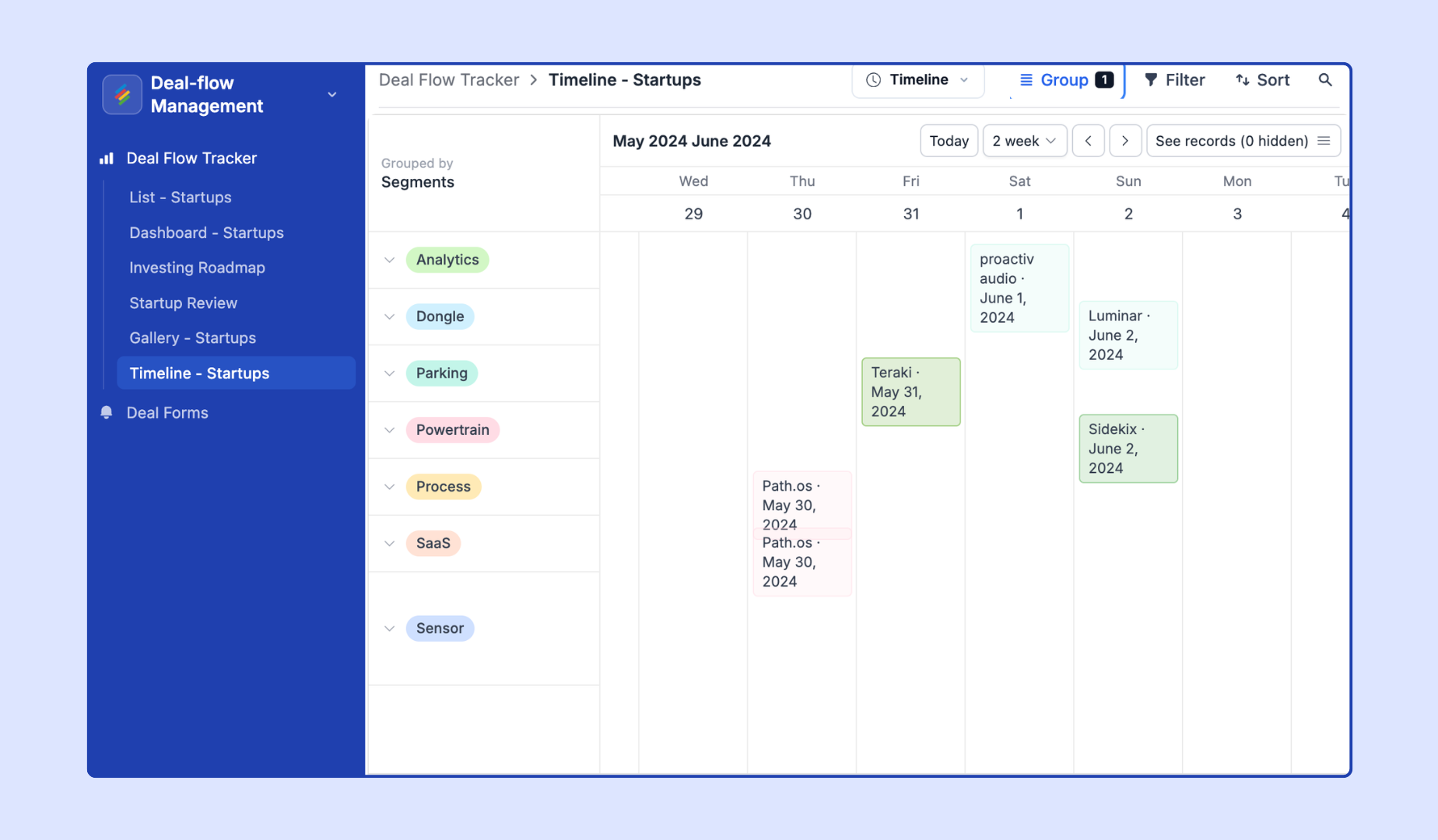
Present your project roadmap in a structured, visual format. The Roadmap layout is designed to communicate strategic initiatives, feature timelines, and delivery plans.
Configuration options:
Choose the source table and view
Set grouping columns for swimlanes (e.g., product area or team)
Select date columns for start and end
Configure the columns displayed on each roadmap card
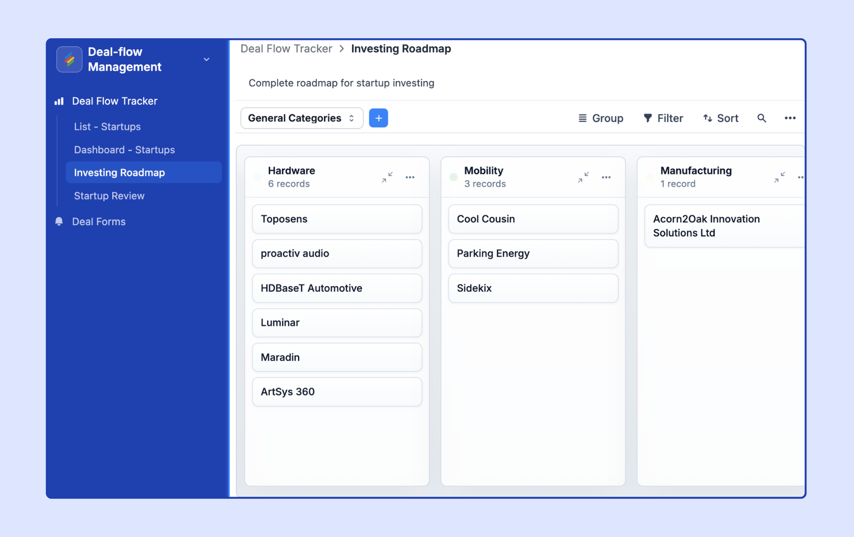
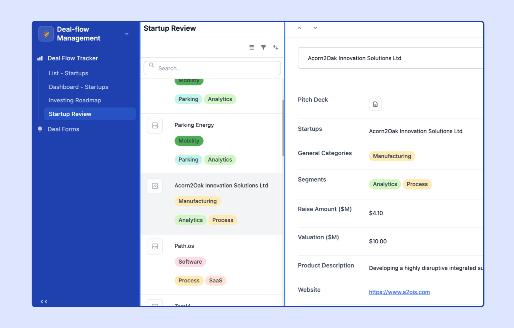
Allow viewers to review and action individual rows one at a time, similar to a flashcard or approval flow. The Record Review layout is ideal for:
Content moderation queues
HR candidate reviews
Approval workflows
Configuration options:
Choose the source table and view
Select which columns are visible in the review card
Configure action buttons (e.g., Approve, Reject) that update a column value
Set the order in which rows are presented
Provide a high-level summary view combining stats, charts, and key metrics in one place. The Overview layout is ideal for:
Executive dashboards
Team performance summaries
Project status pages
Configuration options:
Add chart elements, number summary blocks, and record count elements
Each element connects to a specific table and view
Configure grouping and aggregation for each element
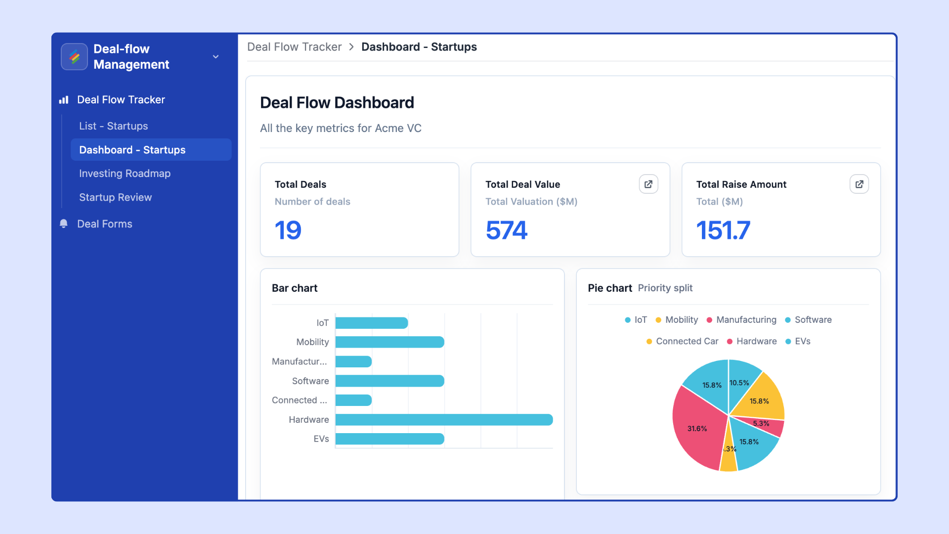
Build a fully customizable dashboard with multiple visual elements on a flexible canvas. Start with an empty canvas and build your app from scratch by adding individual elements. The Blank Layout gives you maximum flexibility.
The Blank layout is the most flexible layout in App Builder and is ideal for:
Operations and business intelligence dashboards
Marketing performance reporting
Multi-team visibility pages
Configuration options:
Add and arrange elements freely on the canvas (drag to position, resize)
Available elements include: charts, tables, number summaries, record counts, text blocks, and images
Each element is independently connected to a table and view
Share a single dashboard with multiple stakeholders
Available elements in Blank Layout:
Table element – Display rows from a table in a grid
Chart element – Add bar, line, pie, or other chart types
Form element – Embed a form directly in the page
Number summary – Display an aggregated value (sum, count, average, etc.)
Record count – Show the total number of rows matching a view's filters
Text block – Add headings, paragraphs, or rich text
Image – Embed an image URL or upload an image
Linked page button – Add a navigation button that links to another page in the app
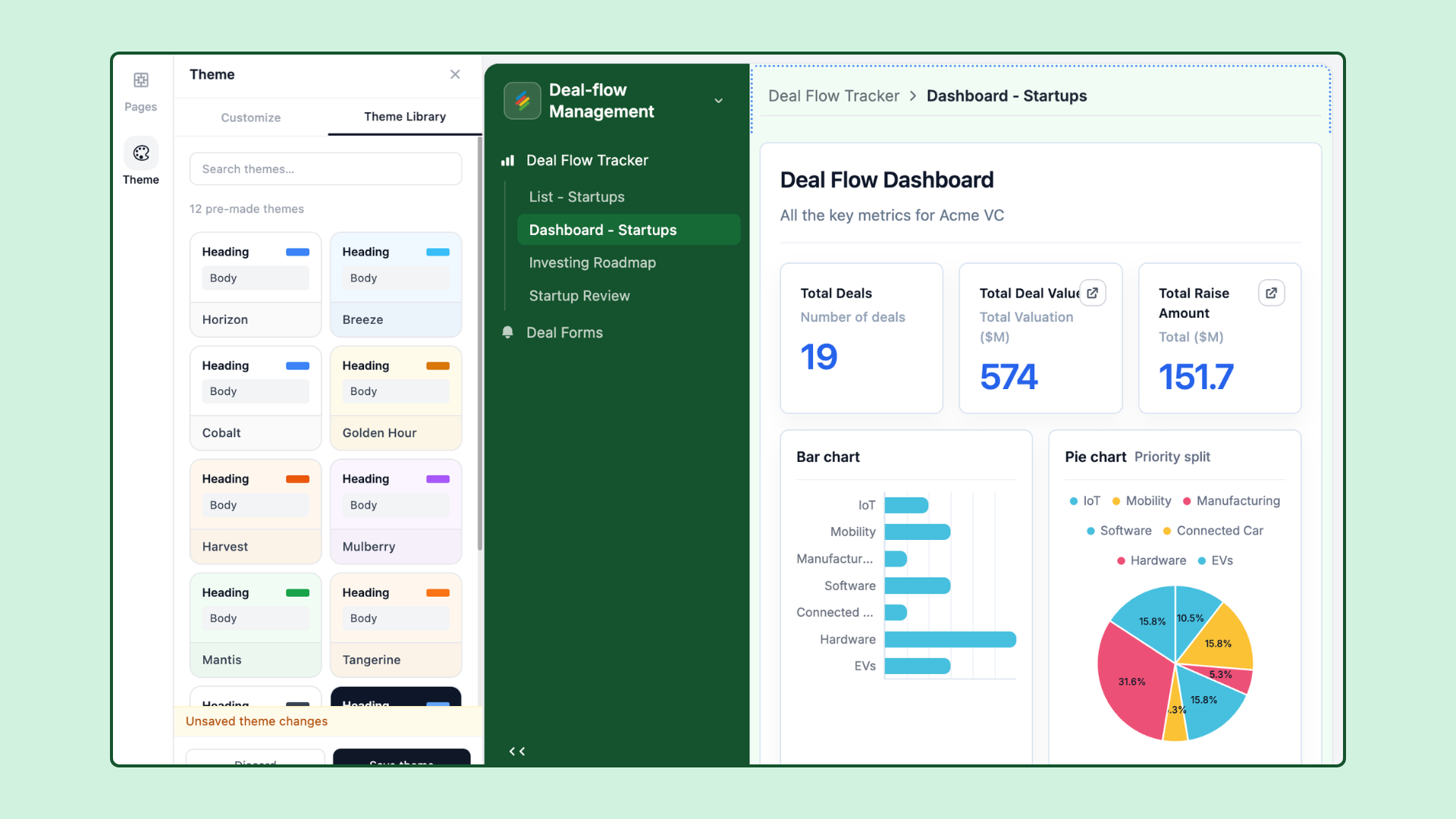
App Builder includes a built-in theming system so you can match the app's appearance to your brand.
To access theme settings:
Open the app in App Builder.
Click ⚙ App Settings > Theme.
Primary color – Sets the accent color used for buttons, links, and highlights throughout the app.
Background color – Sets the app's background color.
Text color – Sets the default text color.
Font – Choose from a set of available fonts for the app's typography.
Logo – Upload a custom logo that appears in the app's navigation header.
Dark / Light mode – Toggle between dark and light base themes.
Changes to the theme apply app-wide and are visible immediately in the preview pane.
Apps can be shared in two ways:
Private (collaborator access) – Only collaborators added to the app or stack can view it. They must be logged in to Stackby.
Public (shareable link) – Anyone with the link can view the app. No Stackby login is required. Public apps can optionally be password-protected.
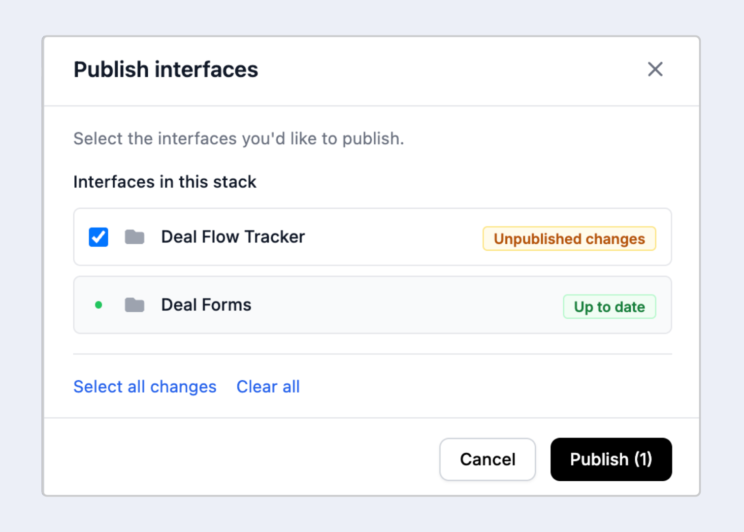
To publish or update sharing settings:
Click Publish or Share in the top-right corner of App Builder.
Toggle Share to web on or off.
Copy the shareable link or configure password protection.
Yes. If you add a Form layout or a Form element to your app and grant viewers the appropriate permissions, they can submit form entries which create new rows in the connected table. Editors with sufficient permissions can also update row values through layouts that support editing.
Yes. Published app pages can be embedded using an <iframe>. Navigate to Share > Embed, copy the embed code, and paste it into your website's HTML.
Yes. An App Builder app can contain as many pages as you need, each with its own layout type, data source, and configuration. Users can navigate between pages using the app's sidebar or top navigation.
Yes. You can configure certain elements and pages to be visible only to specific roles or based on column value conditions. This allows you to create role-specific views within a single app.
Each layout and element in App Builder is connected to a specific table and view. You can use Stackby views with filters applied to control which rows are surfaced to viewers. Combine this with column-level visibility settings in the element configuration to precisely control what data is exposed.
Each stack can have one app with multiple interfaces and pages per interface. There is no set limit on the number of pages within an app, but performance may vary with very large apps containing many elements and complex data sources. Depends on the plan type. Please check Stackby pricing.