The Gallery layout displays records as visual cards in a grid arrangement — with an image, title, and selected fields shown on each card. It is the ideal Interface layout for any data that benefits from visual scanning: product catalogs, digital asset libraries, team directories, recipe collections, property listings, or portfolio showcases.
Digital asset management — Browse a library of images, videos, or documents with thumbnails
Product catalog — View products with images, names, and prices in a shopable grid
Team directory — Display team members with photos, roles, and contact details
Recipe collection — Browse dishes with photos and key info at a glance
Property listings — Show properties with cover images and key specifications
Content portfolio — Showcase published articles, campaigns, or creative work
In the Interface editor, click + Add Page in the left panel.
Select Gallery from the Layout Picker. Click Next.
Choose the source Stack and click Finish.
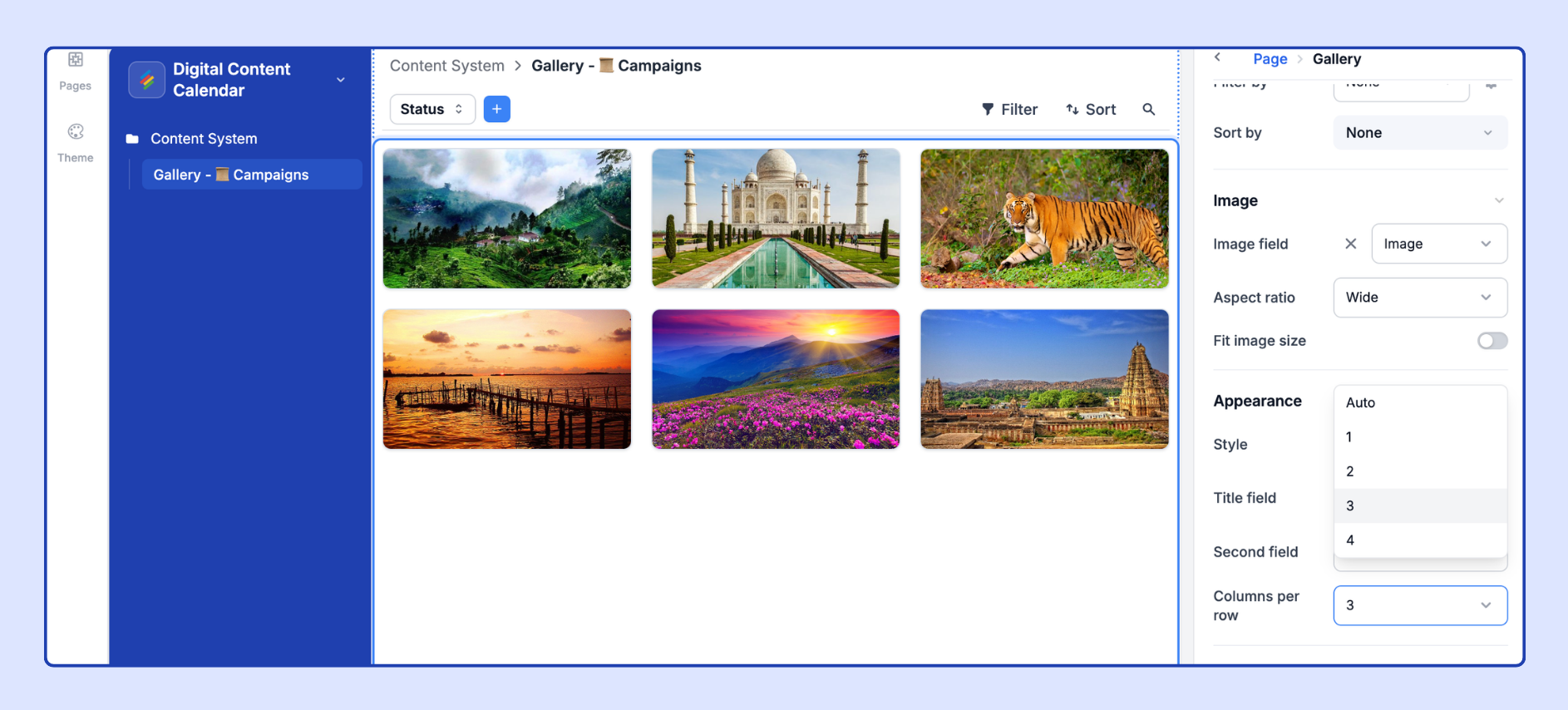
Configure the Image field and other card settings in the properties panel.
The attachment or URL field whose contents are used as the card's primary image. Configuration options:
Attachment field — The first image attachment in the field is used as the card cover. Non-image attachments (PDFs, spreadsheets) show a file-type icon instead.
URL field — If the URL points to a publicly accessible image (JPEG, PNG, GIF, WebP), Stackby fetches and displays it as the card cover. Private or authenticated image URLs will not render.
If no image field is set or a record has no image, a grey placeholder is shown.
The field displayed as the card's primary text label (shown below the image). Defaults to the primary field of the source Stack. Choose a different field if another field better identifies the record for your use case.
Set the order of cards in the grid:
Alphabetical (A→Z or Z→A) by any text field
Numerical (low→high or high→low) by any number field
Date-based (oldest or newest first)
Manual sort — Enable drag-and-drop reordering of cards (requires Edit records inline to be on)
Choose which additional fields are displayed below the image and title on each card. Recommended: 2–4 fields maximum for readability. More fields make cards taller and reduce visual scanning efficiency.
Apply static filters to limit which records appear in the gallery. Examples:
Show only records where Status = "Published" or "Active"
Show only records created by the current user
Exclude archived or draft records
Apply color indicators to cards:
By Select field — Adds a colored accent bar or badge to cards based on a select field's option color.
By Conditions — Custom color rules applied to card backgrounds or borders.
Controls how the card image is scaled to fit the card container:
Toggled ON — Image is cropped/scaled to fill the entire card image area (cover mode). All cards have a uniform, consistent appearance regardless of original image dimensions.
Toggled OFF — Image is letterboxed/pillarboxed to fit within the card area without cropping (contain mode). The full image is visible but cards may have different visual heights.
Recommendation: Toggle ON for product catalogs and visual portfolios where uniformity matters. Toggle OFF for documents or assets where seeing the full image without cropping is important.
Toggle whether field labels (e.g., "Status:", "Price:", "Author:") are shown on cards alongside their values. Toggle OFF for a cleaner, label-free card layout when field meanings are obvious from context.
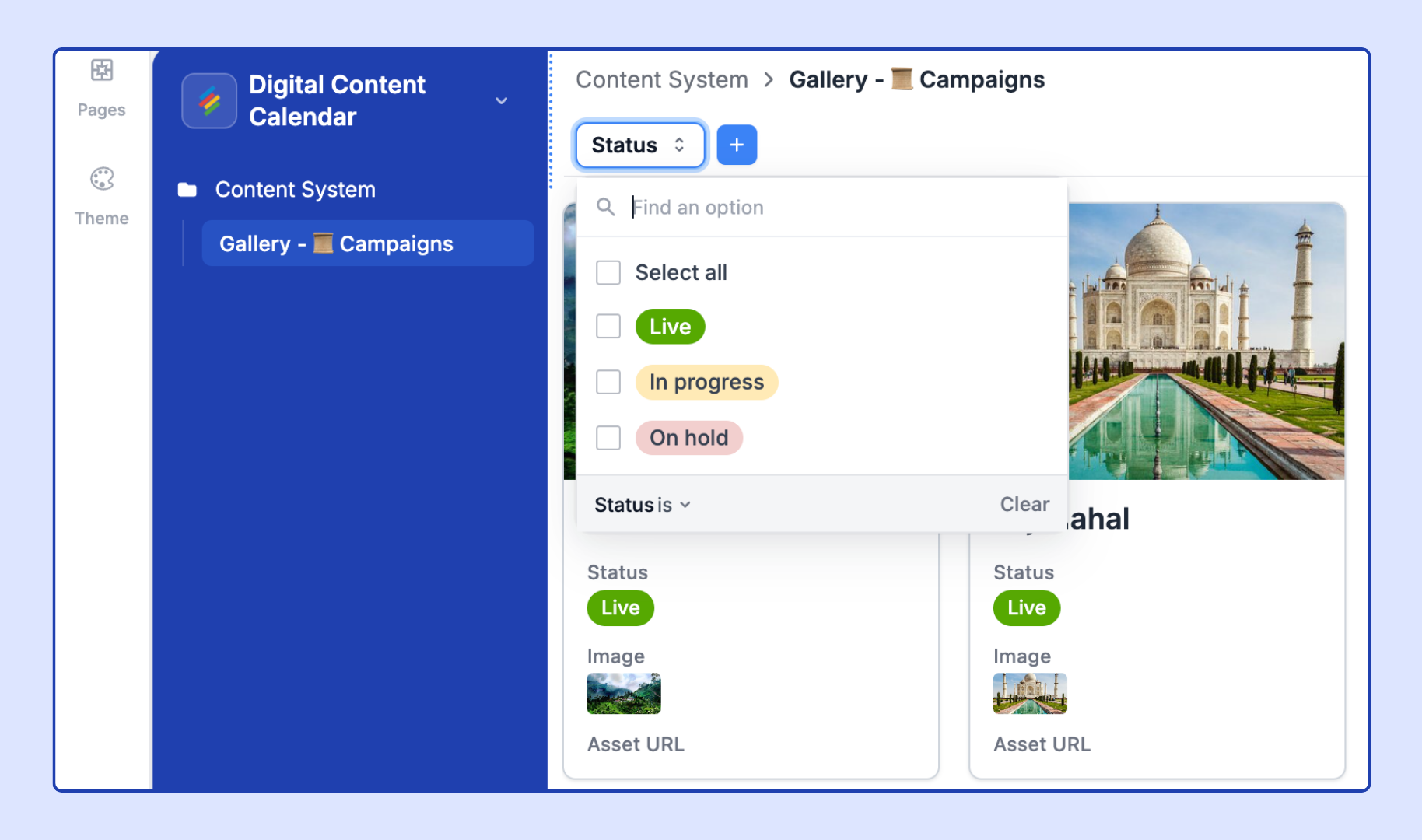
Configure Tabs or Dropdown filters to let end users filter the gallery. Examples:
Tabs: "All Assets," "Images," "Videos," "Documents" (filtered by file type field)
Dropdown: Filter by Category, Author, or Status
Click into record details — Click a card to open the full record detail panel. This is the primary interaction pattern for Gallery pages — users browse cards visually and click into the ones they want to examine or edit in depth.
Edit records inline — Limited inline editing is supported on gallery cards (primarily for select fields and checkboxes rendered on the card face).
Add / delete records inline — Enable a + button in the gallery for adding new records. New records will have blank image fields until files are attached via the record detail panel.
Allow users to export data as CSV — Export the gallery's visible records as a CSV (does not include image files).
For the most visually consistent gallery:
Square images (1:1 ratio) work best for team directories and product catalogs.
Landscape images (4:3 or 16:9) work well for content portfolios and property listings.
Portrait images (3:4 or 2:3) work for book covers, documents, or magazine-style layouts.
Stackby's gallery cards use a fixed-width card grid. Images are scaled to fill card width, so height varies by image ratio when "Fit image size" is off.
For a clean, scannable gallery, limit cards to:
1 image
1 title field
2–3 supporting fields (e.g., Status, Category, Price)
More than 5 fields per card significantly reduces visual clarity. If more detail is needed, configure a Record Detail panel that users can access by clicking any card.
Stackby does not currently generate thumbnail previews for PDF files. PDF attachments display a file-type icon (📄) placeholder in the gallery card's image area. To display a cover image for PDFs, add a separate Attachment field for cover images and use that as the Image field.
Broken image icons appear when: (1) the URL in a URL field links to a private, authenticated, or inaccessible image; (2) the attachment has been deleted from the source Stack; (3) the file format is not a supported image type (JPEG, PNG, GIF, WebP). Hover over the broken icon to see the URL/filename for debugging.
The Gallery layout does not support Group by in the same way as List layout — cards appear in a continuous grid. To create category sections, use the List layout (which supports grouping with collapsible headers) or build a multi-page Interface where each page shows a filtered subset of the gallery for one category.
Stackby loads gallery cards progressively. Very large galleries (thousands of records) load in batches as users scroll. Performance may degrade for galleries with 10,000+ records — use page-level filters to limit the scope of large galleries.