The Kanban layout organizes records as cards arranged in vertical columns (stacks) defined by a single-select, user, or created-by field. It is the go-to Interface layout for any workflow that moves through distinct stages — making it ideal for project pipelines, approval workflows, sales funnels, content production, and sprint tracking.
When a user drags a card from one column to another in a published Interface, the underlying Stack record is updated automatically.
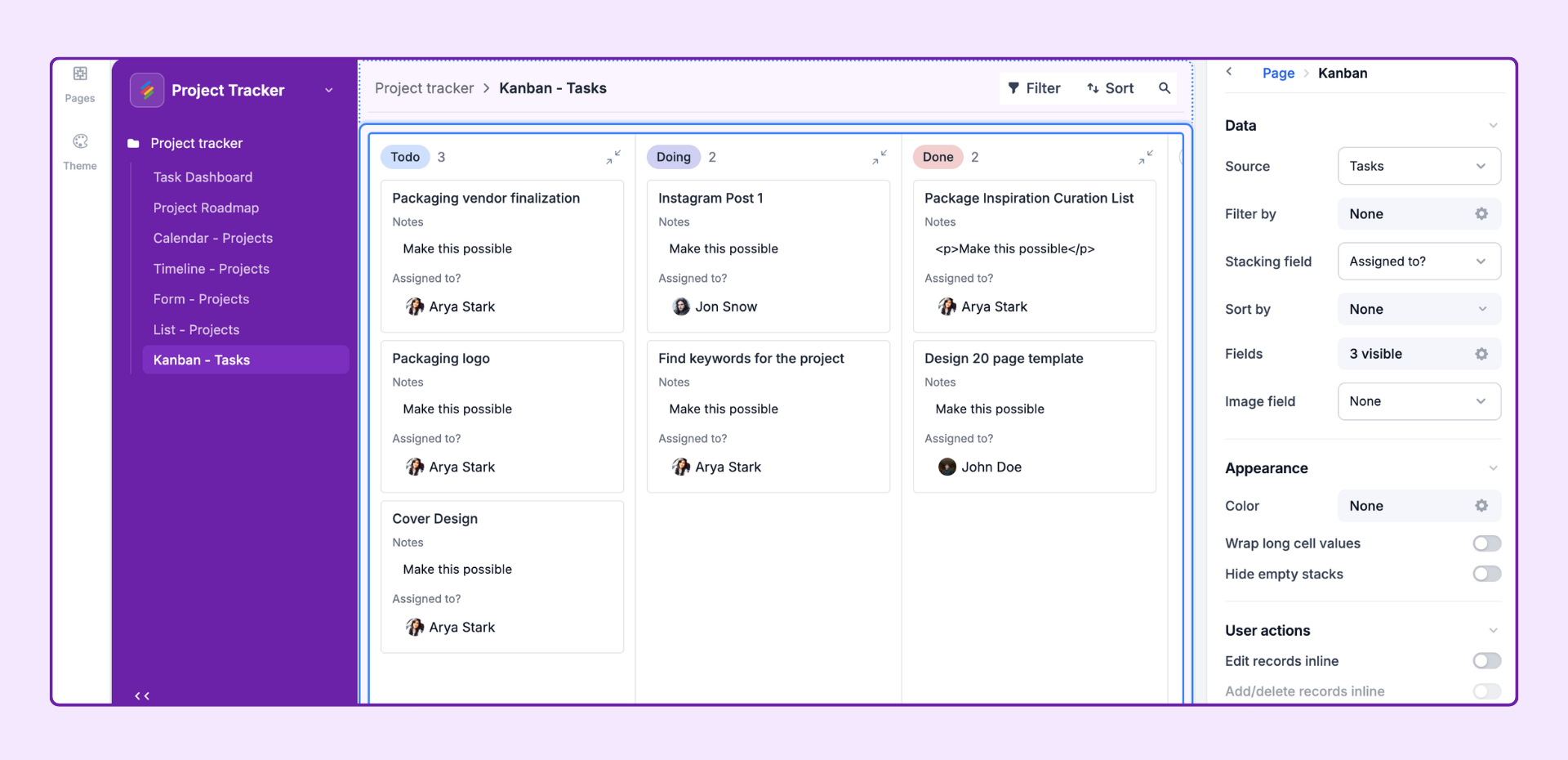
Sales pipeline — Move deals through Lead → Qualified → Proposal → Closed stages
Content workflow — Track articles from Draft → Review → Approved → Published
Hiring pipeline — Move candidates through Application → Interview → Offer → Hired stages
Sprint board — Manage tasks across Backlog → In Progress → Review → Done
Project status — Visualize projects by team or status at a glance
In the Interface editor, click + Add Page in the left panel.
Select Kanban from the Layout Picker. Click Next.
Choose the source Stack and click Finish.
Configure the Stacking Field (the field that defines columns) in the properties panel.
The field whose values define the columns of the board. Each unique value in the field becomes a column. For a Single Select field, each select option is a column. For a User field, each unique assignee is a column.
Only Single Select, User, and Created By fields are supported.
The column order mirrors the option order in the source Stack's field settings. Reorder options in the field editor to reorder columns.
Adding or removing options in the source field automatically adds or removes columns on the board.
Set the order of cards within each column:
Field-based sort — Sort cards alphabetically, numerically, or by date based on a chosen field.
Manual sort — Enable drag-and-drop reordering of cards within columns. Users with Editor permissions can drag cards vertically within a column to change their order. This setting is independent of drag-and-drop between columns (which always works when Edit inline is on).
Choose which fields are visible on each card. Fields appear in the order you set here. Common fields to show on cards:
Primary field (auto-included as card title)
Assignee (user field)
Due date
Priority (select field)
Tags or labels
Attachment thumbnail (image)
Select an attachment field to display as a cover image on each card. The first image in the attachment cell is used as the card thumbnail.
Apply filters to limit which records appear on the board. Examples:
Show only records where Priority = "High" or "Critical"
Show only records assigned to the current user
Exclude archived or cancelled records
Color-code card backgrounds or left-side accent bars:
By Select field — Each option in the chosen field gets a distinct color automatically (inherited from the field's option colors in the Stack).
By Conditions — Set custom coloring rules. Example: turn cards red when Due Date is past and Status ≠ "Done."
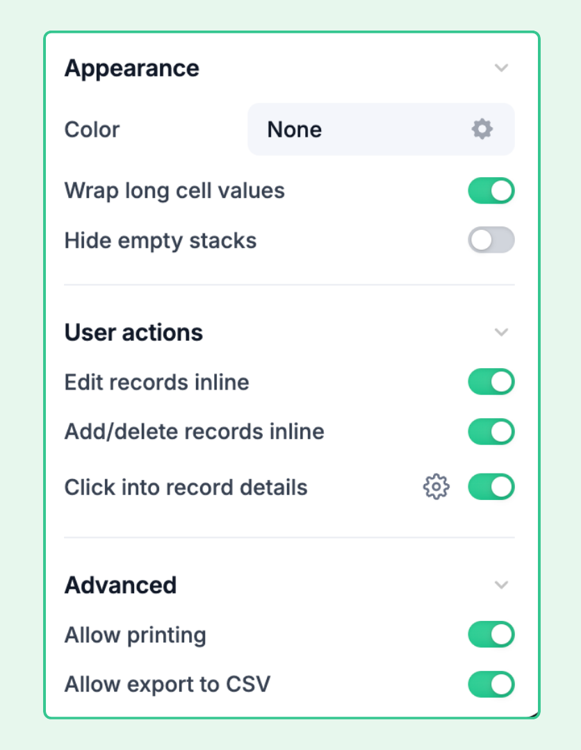
Allow multi-line text in field values on cards. Without wrapping, long text values are truncated. Enable wrapping to show more content on each card at the cost of card height.
Hide columns that currently have no cards. Useful when you have many select options but only a few are actively in use. Users will still see a column appear if a card is moved into it.
Same as List layout — configure Tabs or Dropdown filters to let end users dynamically filter which cards are shown across all columns simultaneously.
Edit records inline — Allow users with Editor permissions to click on a field value directly on a card and edit it without opening the record detail panel. Note: Inline editing on card faces is limited to simple text and select fields.
Add / delete records inline — Show a + button at the bottom of each column to add new records (new cards). The new record is pre-filled with the column's stacking field value (e.g., Status = "In Progress" if added in that column). Users can also delete cards from the board.
Click into record details — Click a card to open the full record detail panel. Required for editing complex field types (attachments, linked records, long text) from the board.
Allow users to export data as CSV — Export all visible cards as a flat CSV file.
Allow users to print — Print/PDF export of the current board state.
The quality of a Kanban board depends on the quality of the stacking field's option design:
Limit columns to 3–8 for readability — too many columns creates horizontal scrolling.
Use a clear, linear progression for workflow stages (Backlog → In Progress → Done).
Add a "Cancelled" or "On Hold" column rather than deleting records to preserve history.
Use the source Stack's field editor to reorder and color-code options — changes reflect immediately on the board.
Configure a Record Detail page so users can click a card to see and edit all fields in depth. This is especially useful when cards display only a summary (3–5 fields) but users need to view or edit the full record occasionally.
Stackby does not enforce WIP (Work In Progress) limits at the column level natively. For teams that use WIP limits, consider using a Number widget in a Dashboard page that counts records per status, with conditional coloring to highlight when a column exceeds the limit.
Native swimlanes (horizontal grouping rows across all columns) are not a separate feature in the Kanban layout. To achieve a similar effect, add a Group by filter so records are visually segmented within each column. Alternatively, use the List layout with Group by enabled for a swimlane-style grid.
Drag-and-drop between columns requires Edit records inline to be enabled in User Actions. Also verify that (1) the user has Editor permissions on the Interface, (2) the stacking field is not a computed field type, and (3) field permissions in the source Stack allow editing.
Each Kanban page is connected to a single source Stack. However, individual cards can display data from linked Stacks by including linked record fields in the Fields configuration.
Not currently — columns are determined by the options in the stacking field, which is configured in the source Stack. To add a new column, add a new option to the single-select field in the Stack editor. The new column will appear immediately on the Kanban board.