The Record Review layout is designed for workflows where users need to work through many records one by one — triaging, approving, reviewing, or updating each record in sequence. It splits the screen into a record list on the left and a detailed view of the selected record on the right.
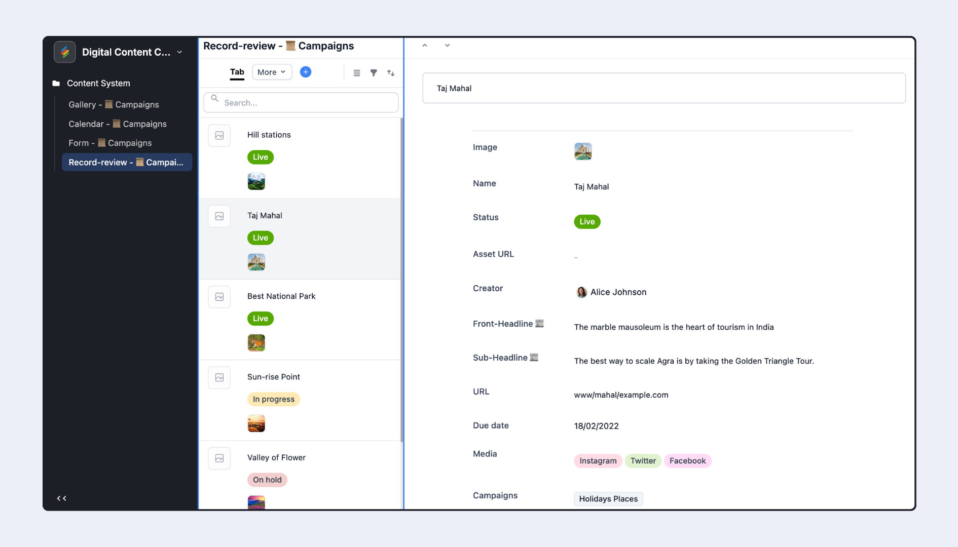
Common use cases:
Content approval workflows — review article drafts, approve or request changes one at a time
Support ticket triage — quickly move through incoming tickets, assign them, and update status
Hiring pipelines — review applicants in sequence, move them through stages
Inventory audit — check items one by one, update condition or counts
Order processing — review and fulfill customer orders in a structured queue
In the Interface editor, click + Add Page.
Select Record Review from the Layout Picker. Click Next.
Choose the source Stack and configure initial data options:
Option A: Click Copy settings from a view to import filter, sort, and group settings from an existing view in the Stack.
Option B: Set Filter, Sort, and Group manually from the dropdown menus.
Click Next.
Choose which fields to show on the record detail panel. Toggle fields on or off. A preview updates in real time. Click Next.
Name the page. Click Finish.
The layout has three distinct configurable surfaces:
The Record List (left column) — shows all records in a scrollable, filterable list.
The Record Detail Panel (right area) — shows the full details of whichever record is selected in the list.
Individual Field Settings — per-field configuration within the detail panel.
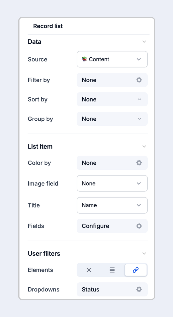
Click on the record list area on the canvas (left side) to open the list properties in the right panel.
Source — The Stack the list is pulling records from. Set at page creation; change it only by creating a new page.
Filter by — Static filters applied to the list. For example: show only records where Assignee is the current user, or where Status ≠ "Done."
Sort by — One or more fields to sort the list. Supports alphabetical, numerical, and date-based ordering.
Group by — Group records into collapsible sections. For example: group by Project, Status, or Priority.
Color by — Color-code list items by a select field or conditions to create visual priority signals.
Image field — Show a thumbnail from an attachment field next to each record in the list.
Title — Choose which field acts as the primary label for each list item (defaults to the primary field).
Field 1 and Field 2 — Choose up to 2 additional fields to show as secondary context inline in the list.
Control whether and how end users can filter the record list themselves:
None — Users cannot change which records appear in the list.
Tabs — Display preset filters as clickable tab buttons above the list (e.g., "All," "Mine," "Pending").
Dropdown — Display preset filters as a dropdown selector.
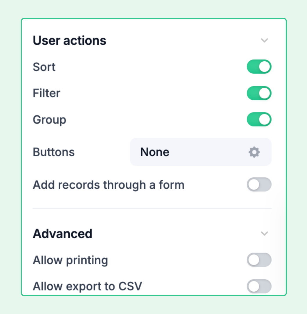
Sort — Let users change the sort order of the list.
Filter — Let users apply their own filter conditions (stacked on top of builder-set filters).
Add records through a form — Adds a + button in the top right of the list. Clicking it opens a form for creating new records. The form must be configured as a separate Form layout page in the Interface.
Buttons — Add action buttons to the list panel (e.g., "Go to Dashboard," "Open External URL").
Allow users to export data as CSV — Adds an export option so users can download the current list as a spreadsheet.
Allow users to print — Lets users print the list or save it as a PDF.
Click on the detail area (right side of the canvas, showing an individual record's fields) to open detail panel properties.
Title field — Choose which field acts as the record's heading in the detail panel. Defaults to the primary field.
Fields — Choose which fields are visible or hidden in the detail view. Drag to reorder.
To add field groups or new fields, hover over the detail canvas to reveal + Add group or + buttons.
Title size — How large the record title is displayed (small, medium, large).
Show as full width — Expands the content container to use all available horizontal space (useful on wide screens).
Comments — Allow users to leave comments on records from within the Interface detail view.
Revision history — Show a record's change history. Users can see changes made via the Interface, automations, or other methods — for fields that are visible in the detail panel.
Allow users to print — Print the detail view.
Buttons — Add action buttons to the detail panel. Supported actions include: Update Record, Copy Link to Record, Open Form, Go to Interface Page, Open External URL.
Click on any individual field in the record detail panel to configure it specifically:
Override the field's display label in the Interface without renaming the field in the source Stack.
Edit field — Modify the field type and properties (changes apply to the underlying Stack).
Permissions — Toggle between View-only and Editable for users interacting with this field in the Interface.
Style / Size — Visual options that vary by field type.
Helper text — Contextual guidance shown below the field label in the detail panel.
Visibility — Show or hide the field based on conditions (e.g., show "Resolution Notes" only when Status = "Closed").
When you group records by a field (e.g., Status), the list displays records inside collapsible group headers. In the published Interface, users see:
Group headers as expandable/collapsible rows
Records nested beneath their group
A count of records in each group
Grouping is particularly useful for triage workflows where records need to be reviewed in batches by status, priority, or category.
Record Review is an interaction-focused layout built for reviewing individual records in depth. When you click a record in the list, the full detail panel replaces the list view — you're focused on one record at a time. A Grid visualization in a Dashboard shows all records simultaneously in a table format, optimized for scanning many records at once rather than deep review of individual ones.
Yes — at the field level. Click on any field in the detail panel to set Permissions: View-only or Editable. You can also restrict editing at the Interface permission level (giving users Viewer vs. Editor access).
The Record List is connected to a single source Stack. However, within the Record Detail panel, linked record fields from other Stacks will show their linked records and allow users to expand them — giving access to related data across Stacks without leaving the Interface.
Yes. When you enable Add records through a form, you'll be prompted to select or create a Form layout page within the same Interface. The form opens in a modal overlay when the + button is clicked.